From distressed typewriter to grown-up grid.
Typo, the stationery and lifestyle brand inside the Cotton On Group, rolled out a comprehensive global rebrand across April 2026. The visual system moves from a "kitschy, loud, quirky" 2000s-inspired identity (distressed typewriter wordmark, unicorns and rainbows, IP licensing tie-ins) to a "Pinterest-curated lifestyle studio" aesthetic built on a cleaner, geometric wordmark and a restrained colour palette: jade green, plum noir, glacial blue, wasabi.
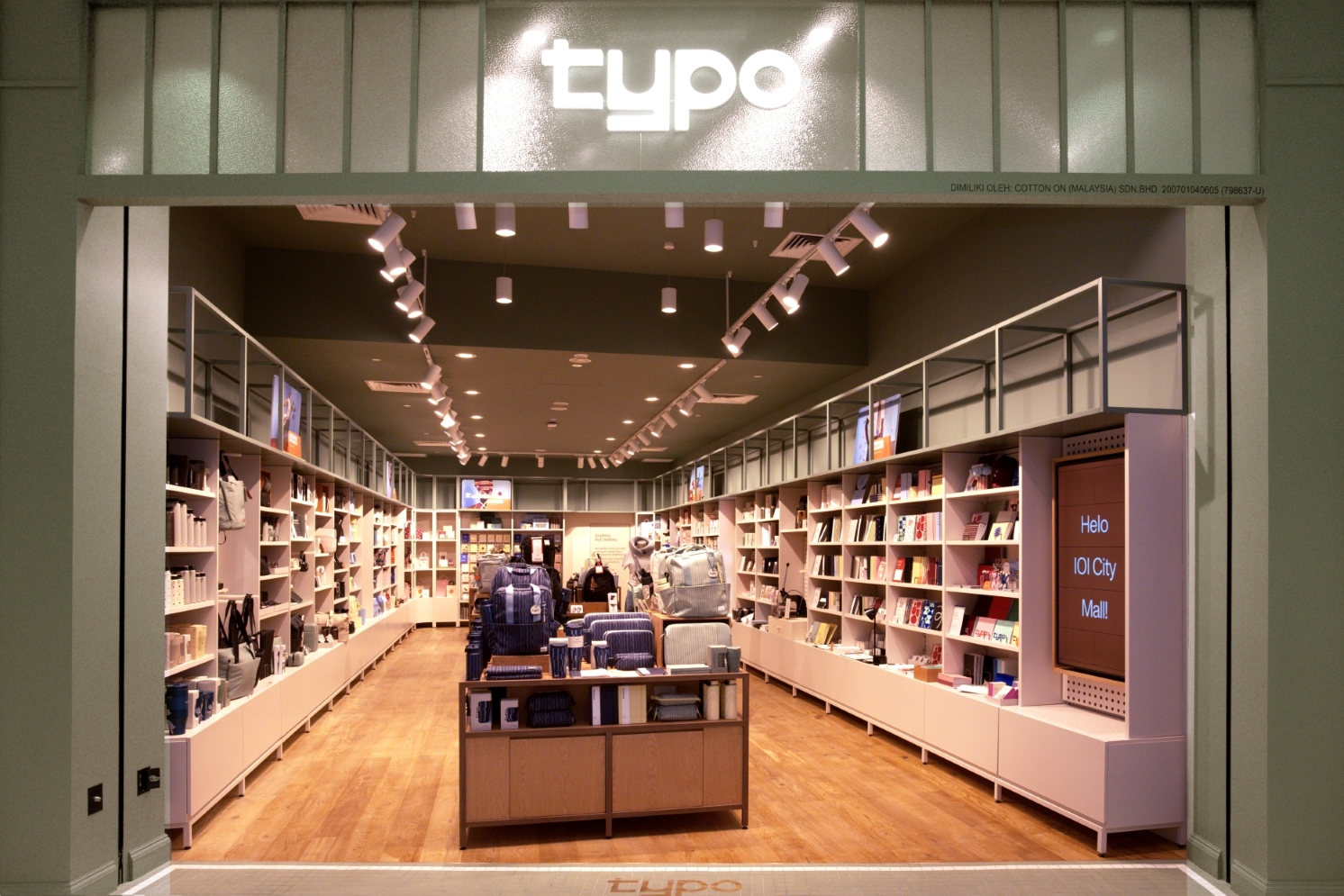
The refresh hit @typoshop, the UK and South Africa social channels, and typo.com globally first; the physical expression debuted at a world-first concept store at IOI City Mall, Putrajaya, Malaysia, on 2 April 2026.
The relevance to ByBento is direct: Typo is showing how a creative-services-adjacent brand can look design-led, premium, and grown-up without going austere, and the geometric primitives (circle and square, grid, pixel-meets-pen-point) are exactly the kind of system that scales across digital, print, and signage.
What's observable from primary sources.
From typo.com, the @typoshop Instagram, the Cotton On Group press release, and trade press coverage.
Logo / wordmark
| Aspect | Old (pre-2026) | New (rebrand) |
|---|---|---|
| Wordmark | "Distressed typewriter" font, slightly broken letterforms, low-fi feel | Cleaner, boxier, geometric construction, modern sans logic |
| Mood | Quirky, retro-zine, teen | Considered, design-studio confident, age-up |
| Source quote | "leaving behind its distressed typewriter font" | "for a cleaner, boxier look" — Marketing-Interactive, 29 Apr 2026 |
The clearest articulation of the system's idea is the Instagram caption from the tease post:
A love story between the circle and the square. A place where the pixel meets the pen point. Made from typo, the perfect grid. Shaped by the same… @typoshop, system tease post (DScThSaARJf)
This is doing real work. It tells you the wordmark is grid-built, that letterforms are constructed from primitives (likely circle terminals plus square stems, or vice versa), and that the system explicitly pivots between digital (pixel) and analogue (pen point). The phrasing "the perfect grid" suggests the underlying construction is exposed in the brand book and likely shown in stationery pattern work, in-store fixtures, and packaging.
The official rebrand-reveal post (DXLjMn6jBds, 15 April 2026) is dialled-back:
Things are changing, did you notice? (We hope you did). New logo, even better product, the same Typo you know and love. @typoshop, rebrand reveal — 15 April 2026
Typography Unverified
Not yet definitively identifiable from a primary source. The typo.com CSS stack falls back to Helvetica Neue / Arial, which is the live-site fallback only — the wordmark itself is almost certainly a custom or licensed display face.
Likely candidates, listed by visual probability based on the "circle and square" geometric construction described:
| Candidate | Why it fits | Why it might not |
|---|---|---|
| Custom geometric wordmark | "Made from the perfect grid" reads like a brand-book line about a custom build, and Cotton On Group has internal capability | No public attribution to a foundry, no name announced |
| F37 Bolton / F37 Sonic | UK foundry, geometric-grotesque construction, very on-trend for 2026 retail rebrands | Not confirmed |
| Söhne (Klim) / Söhne Breit | The "boxier" descriptor and current ubiquity in considered retail rebrands | Söhne reads more editorial / serious than Typo's playful brief |
| Neue Haas Grotesk / Neue Haas Unica | Roy's intuition; clean modern sans territory | Less circle / square geometric, more humanist neo-grotesque |
| Inter | Free, geometric-leaning, ubiquitous in tech rebrands | Reads as default-modern, less likely for a mid-tier retail brand wanting distinctiveness |
Recommendation for Jelly
Treat the wordmark as a custom geometric build until the agency is identified. The interesting move is not the typeface choice; it's the system rule that the letterforms are constructed from circle and square primitives, which means the same primitives can run as standalone marks across the brand.
Colour palette Press confirmed
The four named colours are confirmed via Marketing-Interactive (29 Apr 2026). Three additional colours are pulled from typo.com trending categories. Hex values are estimated and need swatch verification from the official guidelines once published.
The site itself runs UI on near-blacks (#000000, #333434), white, and an accent red (#E40E2E) for sale and CTA — but those are e-commerce chrome, not the brand identity. The real palette is the named seasonal-but-permanent four: jade green, plum noir, glacial blue, wasabi. All four are muted, slightly desaturated, and read as a grown-up lifestyle palette rather than a stationery palette. The shift from rainbow / unicorn to this is the single biggest signal of the brand re-pitch.
Layout principles
From typo.com homepage and the concept store coverage:
- Open, immersive layouts — described in press as a "creative playground"
- Grid as foundation — caption: "Made from the perfect grid"
- Geometric primitives as motifs — circle and square explicitly called out as a love-story construct
- Cross-stitch-inspired patterns in the secondary system (Marketing-Interactive)
- Squiggles and doodles as fluid counter-elements to the rigid grid (per Cotton On Group press release)
- Whitespace generous, product-led — typo.com hero is photography-forward with restrained type
- Hero copy short and declarative — "Our best stationery yet. Smoother pages. Better pens." / "It's more than a new logo."
The central design move
The system reads as rigid grid + soft hand-drawn counterpoint. That tension is the brand's central design move. It's the same move Mailchimp made (sans-serif system + Cavendish illustrations), and the move COS uses (architectural type + soft product photography).
Photography and image treatment
- "Pinterest-curated lifestyle studio" is the press descriptor
- Product-led, on neutral backgrounds, often shot front-and-back to show construction quality
- Fewer mascot characters, fewer IP tie-ins
- Wider lifestyle reach: gifting, travel, everyday essentials sit alongside stationery
- Concept store imagery shows desk-top tableau styling with paper-craft textures
Motion and animation
Not deeply observable from typo.com (standard e-commerce site behaviour). The Instagram reels (DXLjMn6jBds, DWlte0dj3jF) use the new wordmark with simple cut-style transitions. Worth scoping further once the agency is identified or a brand guidelines document leaks.
Tone of voice
Sample copy verbatim from the brand:
A love story between the circle and the square. A place where the pixel meets the pen point.
Things are changing, did you notice? (We hope you did). New logo, even better product, the same Typo you know and love.
Our best stationery yet. Smoother pages. Better pens.
It's more than a new logo. Discover our new chapter.
A simple piece of paper can become anything – a plan, a dream, a doodle, a moment of joy.
The voice is declarative, short, romantic without being precious, confident without being smug. It uses parentheticals to soften ("did you notice? (We hope you did)"), it uses listing rhythm ("a plan, a dream, a doodle"), and it leans hard on poetic abstraction in the brand-launch tier ("a love story between the circle and the square") while staying functional in the product-launch tier ("smoother pages, better pens"). Two-tier voice: one for brand, one for transactional.
Likely in-house. Not yet credited publicly.
Confidence: UNKNOWN
No design publication (Brand New / It's Nice That / Design Week / Creative Review / Fonts In Use / Behance / Dribbble) has covered or credited this rebrand as of 2 May 2026. The Cotton On Group press release does not name an external agency. Marketing-Interactive does not credit one. MARKETECH APAC does not credit one.
Strongest evidence — likely in-house
A live job listing on talent.com for a "Junior Graphic Designer – Typo Global Support Centre" in Geelong, Australia (Cotton On Group HQ) explicitly says Typo is "in the midst of a bold rebrand" and the role is to "upgrade all touchpoints of the Typo brand" working alongside "mid-weight & senior designer" in a "studio team". That language pattern (studio team, in-midst-of-rebrand, internal hierarchy) is consistent with an in-house creative team executing the rollout, even if a strategic agency was used for the strategy and core identity build.
Cotton On Group's senior creative bench
Identified via LinkedIn:
| Name | Role | Likely involvement |
|---|---|---|
| Sarah Webb | Creative Director, Cotton On Group | Likely senior signoff |
| Jeremy St Quentin | Creative Manager, Cotton On Group | Brand / campaign lead |
| Lisa Tyler | Head of Product – Global, Typo | Product / range owner, not identity author |
| Scott Druce | General Manager, Typo (appointed Dec 2024) | Commissioned the refresh, not the designer |
| Jesse O'Sullivan | Senior Brand Manager, Typo | Brand custodian |
Top candidate scenarios, ranked
- In-house Cotton On Group studio + Typo studio team. Most likely given the job-ad language, the absence of any agency PR claim, and Cotton On's scale (1,300 stores, internal design capability). Treat this as the working hypothesis.
- External strategy / identity agency, in-house rollout. The system is sophisticated enough (the circle-and-square primitive, the cross-stitch secondary, the named palette) that a strategic external partner is plausible. If so, the agency has not yet published the case study. Watch It's Nice That, Brand New, and Design Week through May–June 2026.
- Australian / Melbourne studio. If external, the most probable origin is Melbourne (Cotton On Group is based in Geelong, ~75km from Melbourne). Studios worth scouting: For The People, Universal Favourite (Sydney), Hofstede, Studio Round, Christopher Doyle & Co.
No-name-inference rule
I am NOT asserting an agency. The Instagram posts have no design-credit tag, the press has no credit line, and no agency portfolio shows the work. Until a primary source surfaces — agency case study, designer LinkedIn post, magazine article naming them — Jelly should treat this as unattributed.
Action for the briefing. Ask Roy whether he wants to email Typo / Cotton On Group's PR team directly to ask. They will likely confirm.
What's been written, what's missing.
| Publication | Date | Summary |
|---|---|---|
| Cotton On Group (official) | 3 Apr 2026 | Concept store launch, no identity-attribution detail |
| Marketing-Interactive | 29 Apr 2026 | Most detailed brand-refresh narrative: distressed-typewriter to boxier wordmark, jade / plum / glacial / wasabi palette, cross-stitch patterns |
| MARKETECH APAC | Apr 2026 | APAC-region trade coverage of the same launch |
| Malaysian Foodie | Apr 2026 | Local consumer coverage, store experience focus |
| Inside Retail Australia | May 2025 | Pre-rebrand interview with new GM Scott Druce signalling "elevated" direction |
| @typoshop reveal reel | 15 Apr 2026 | Official "new logo" reveal post |
| @typoshop system tease | Apr 2026 | "A love story between the circle and the square" — best articulation of the design system |
| @typoshop concept store reveal | Apr 2026 | World-first IOI City Mall concept store reveal |
| Typo South Africa V&A reel | Apr 2026 | New SA store fitout, Cape Town V&A Waterfront — Roy can visit in person |
Notable absences
Worth re-checking in 4 to 8 weeks:
- It's Nice That — no coverage as of 2 May 2026
- Brand New (UnderConsideration) — no coverage
- Design Week (UK) — no coverage
- Creative Review — no coverage
- Fonts In Use — no entry
- Behance / Dribbble — no agency case study posted
The design press silence is itself a signal. Either the agency has not yet released the case study (typical 4 to 12 week delay), or the work is in-house and never will get the case-study treatment.
The translations, and the trap.
ByBento is a Cape Town-based managed-creative CaaS brand. The Typo system has elements that translate directly and elements that do not.
Direct translations
| Typo element | How it translates to ByBento |
|---|---|
| Geometric primitive system (circle + square) | A primitive-led mark gives ByBento a kit-of-parts that scales across pitch decks, invoices, the OS 5 product UI, and Roy's photography portfolio. Primitives are easier to brief contractors against than illustration |
| Restrained four-colour named palette | ByBento has been visually loose. A tight named palette ("we use four colours, full stop") signals operator-grade discipline, which is the brand promise — managed creative |
| Two-tier voice (poetic brand + functional product) | Maps cleanly to ByBento brand voice (CaaS pitch, founder-led narrative) vs ByBento operational voice (project briefs, status reports, OS 5 microcopy) |
| Grid-as-foundation | A literal expression of "the management vacuum gets filled by structure". The grid is the brand promise |
| Hand-drawn counterpoint (squiggles, doodles) | Keeps ByBento human and creative-industry-native, avoiding the cold consultancy aesthetic that plagues SaaS rebrands |
| Photography-forward layouts | Roy is a working photographer. Letting the photography breathe instead of competing with type is the obvious move |
Where Typo's positioning differs from ByBento's
| Typo | ByBento |
|---|---|
| B2C retail consumer | B2B creative services / CaaS |
| Mid-market price point | Mid-to-premium R-budget |
| Sells objects (paper) | Sells outcomes (managed creative delivery) |
| Volume-driven (1,300 stores) | Account-driven (small number of strategic clients) |
| Playful is the hook | Operator-trustworthy is the hook; playful is the texture |
The trap to avoid
Borrowing Typo's consumer-cute tone. ByBento clients (CTIJF, Defender Trophy, Stitch) are buying reliability and taste, not whimsy. The brand identity should feel like Typo's grid + restraint without Typo's retail playfulness amplitude.
Concrete moves Jelly could borrow
- A primitives-led wordmark built from a named geometric kit (circle + square, or rectangle + arc) that doubles as a pattern library.
- A four-name palette — non-standard names ("plum noir, jade green") signal the brand has authored its own world rather than borrowing Pantone vocabulary.
- A two-track voice documented in the brand book: brand voice for landing pages and pitch decks, operational voice for client-facing project artefacts. Typo proves you need both.
- A grid that is visible — the same grid runs across web, deck, invoice, contract. Show the grid as a brand asset, not hide it.
- Photography over illustration — ByBento has Roy. Use him.
- One restrained system, one warm counterpoint — the cross-stitch / squiggle move keeps Typo from feeling sterile. ByBento needs an equivalent: maybe pencil annotation, maybe analog texture, maybe Roy's handwritten margin notes.
Typo's system echoes elsewhere.
Roy mentioned "overlap with my original references". The Typo system sits in a clear lineage. Likely parallels:
| Brand / system | Designer / agency | Where Typo overlaps |
|---|---|---|
| Mastercard rebrand 2016 | Pentagram (Michael Bierut) | Pure geometric primitives (two circles), restraint, system-as-asset |
| COS | In-house (H&M Group) | Architectural sans, generous whitespace, photography-led, restrained palette |
| Aesop | Long-standing in-house with Marx Design lineage | Restrained palette, type as primary identity carrier, soft product photography |
| Mailchimp post-2018 | Collins (NYC) | Sans-serif system + warm hand-drawn counterpoint (Cavendish) — same "rigid grid + soft texture" tension Typo is using |
| Papier (UK stationery) | Ragged Edge (rebrand 2021) | Direct competitor space, similar age-up-the-stationery-brand brief |
| Crane Paper Company | Collins | Stationery-adjacent, art-deco-leaning lift, premium positioning |
| MUJI | Kenya Hara (creative direction) | The original "no-design design", grid + restraint + product-led |
| Notion (post-2024) | In-house | Geometric primitives + soft texture, age-up of a quirky early brand |
| A24 | In-house with Trollbäck+Co lineage | Four-colour palette discipline, grid-as-system, type-led identity |
| Type-led retail (Glossier, Allbirds, Everlane originals) | Various | The broader "considered millennial-grown-up" lifestyle category |
The two strongest single references
The single closest parallel is Mailchimp post-Collins for the rigid-system-plus-warm-texture tension, and Papier for the direct sector adjacency (stationery age-up). If Jelly wants to pull a single reference into the briefing, those two are the strongest.
Five briefing prompts Roy can use directly.
- "Show me the kit-of-parts." Ask Jelly to propose a ByBento primitives kit equivalent to Typo's circle-and-square. What two or three shapes carry the brand? Get them down to a defendable minimum before any wordmark exploration starts.
- "What is our cross-stitch?" Typo's rigid grid is softened by cross-stitch patterns and doodles. ByBento needs an equivalent counterpoint that signals creative humanity without undermining operator credibility. Ask Jelly to propose three options (e.g. pencil annotation, analog photography textures, hand-drawn project marks).
- "Name the four colours." Demand that Jelly propose a four-colour named palette with non-Pantone names. The naming convention is the brand discipline. Ask them to walk through how each colour earns its place against ByBento's actual deliverables (deck, invoice, OS 5 UI, photo treatment).
- "Document two voices." Ask Jelly to deliver brand voice guidance in two registers from the start: founder-narrative voice (pitches, landing page, About) and operational voice (project briefs, status reports, OS 5 microcopy, client emails). Typo proves you need both.
- "What is our agency-attribution play?" Pragmatic question for Jelly: when ByBento's identity ships, where do they want it credited (Brand New, It's Nice That, Design Week, Creative Review)? Building toward press attribution shapes the rigour of the documentation. Get the deliverable list right at briefing-stage, not at handover.
Bonus question for Roy to pose to Typo / Cotton On directly
Email pr@cottonongroup.com.au or reach out to Sarah Webb (Cotton On Group Creative Director) on LinkedIn to confirm whether the Typo identity was developed in-house or with an external partner. The answer materially changes the comparable benchmark.
Where this came from.
Primary sources, confirmed:
- cottonongroup.com.au/news/typo-launches-world-first-concept-store-in-malaysia
- marketing-interactive.com — Typo unveils world-first concept store, brand refresh push
- marketech-apac.com — Typo unveils first-ever concept store
- malaysianfoodie.com — elevated new chapter begins
- insideretail.com.au — Typo's GM reveals next move (May 2025)
- instagram.com/typoshop
- instagram.com/reel/DXLjMn6jBds — rebrand reveal
- instagram.com/p/DScThSaARJf — system tease
- instagram.com/p/DW0WEV7kU8i — Asia concept store
- instagram.com/reel/DXgWAL4iOnn — V&A Waterfront fitout
- typo.com
- Typo-IOI-Mall-Malaysia_1.jpg (Cotton On Group)
- Marketing-Interactive — Typo logo image
- Marketing-Interactive — Typo Malaysia store image
- Lisa Tyler — Head of Product, Typo
- Jeremy St Quentin — Creative Manager
- Sarah Webb — Creative Director, Cotton On Group
- Jesse O'Sullivan — Senior Brand Manager, Typo
- Nick Jacob